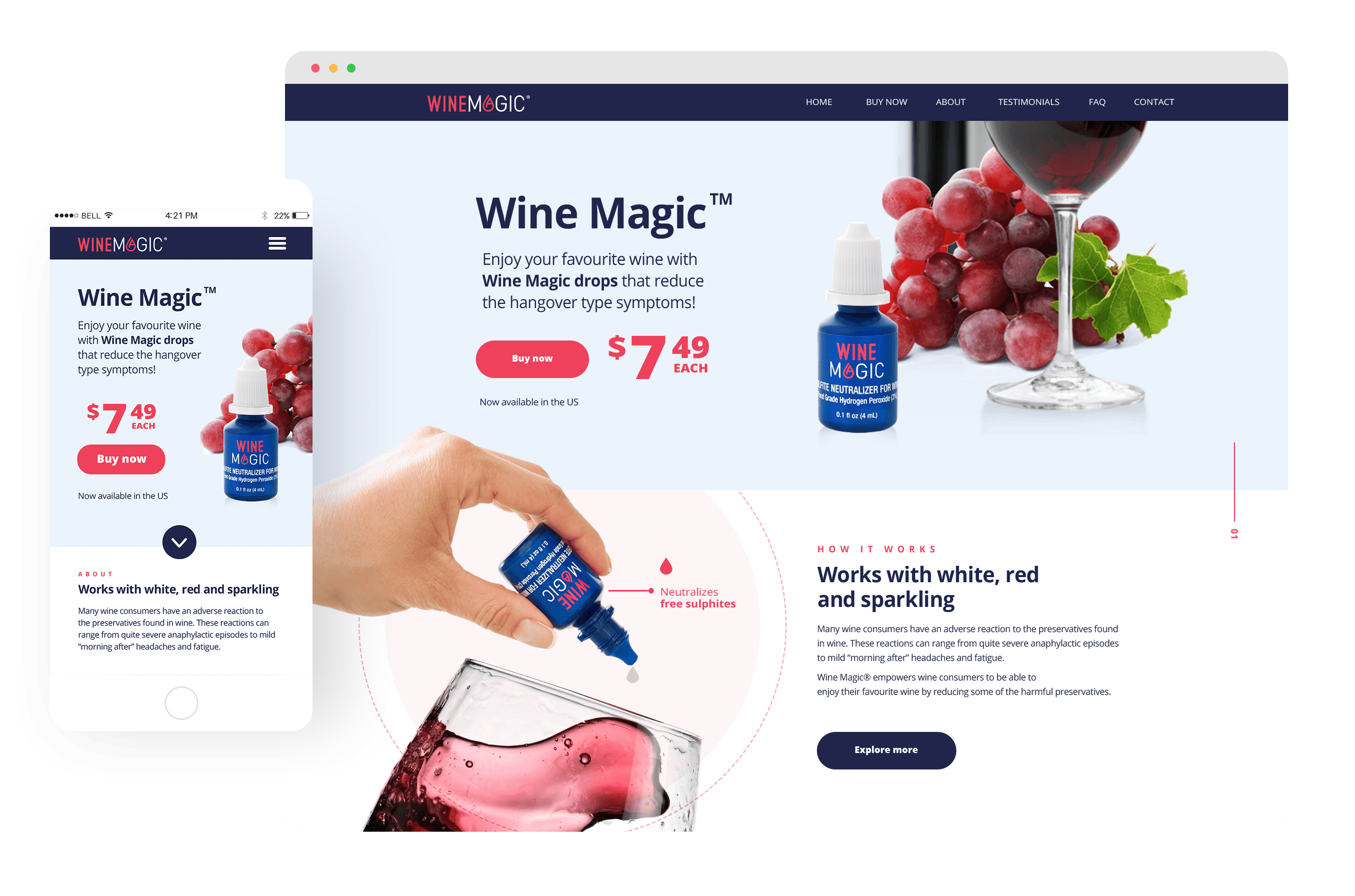
Wine Magic has partnered with Pure Wine to sell a sulphite neutralizer for wine, a product that helps wine consumers to enjoy their favourite wine with reduced hangover-type symptoms the next morning. This was a random startup project. My role as an Art director/UX Designer was to create the new brand strategy and visuals for Wine Magic, product packaging, and the point of sale i.e. the brand new website. To analyze partner’s brand materials and understand what parts worked well and what parts required improvements.
Goals
The biggest challenge I faced was to establish a direct connection between the product and the wine. The perception that the partner’s packaging translated very much reminded a medical product (eye drops). My goal was to come up with a unique aesthetics that met project requirements and set a new perception and direction for the brand within the established budget.
Logo design process
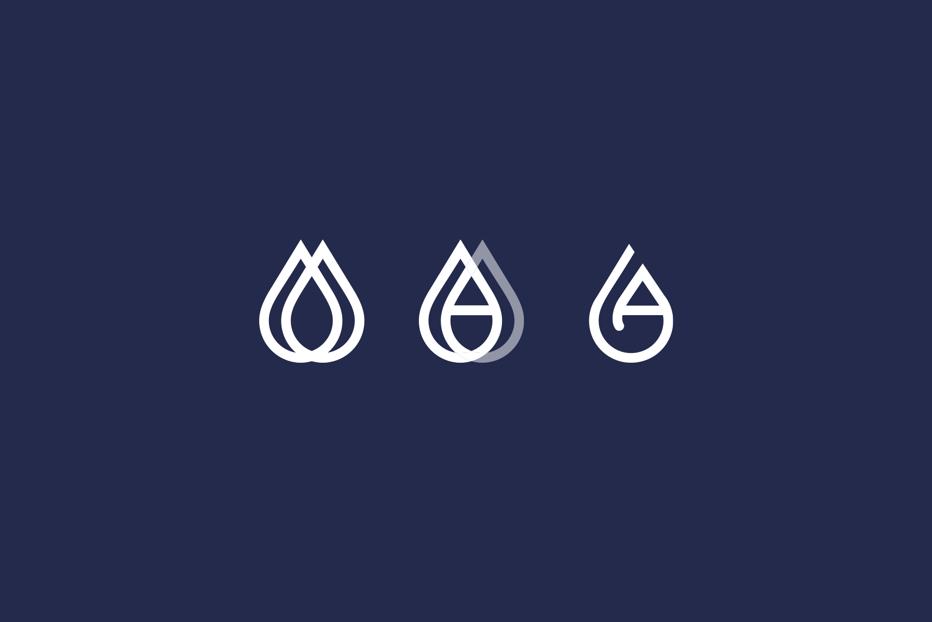
My design process started with re-thinking logo ideas. A shape starts revealing from the beginning from the letter ‘A’ that I turned into a drop.
Typography and Colors
Grape #007eff
Rose #c62a41
Roboto
A B C D E F G H I J K L M N O P Q R S T U V W X Y Z
Open Sans
A B C D E F G H I J K L M N O P Q R S T U V W X Y Z
New Packaging
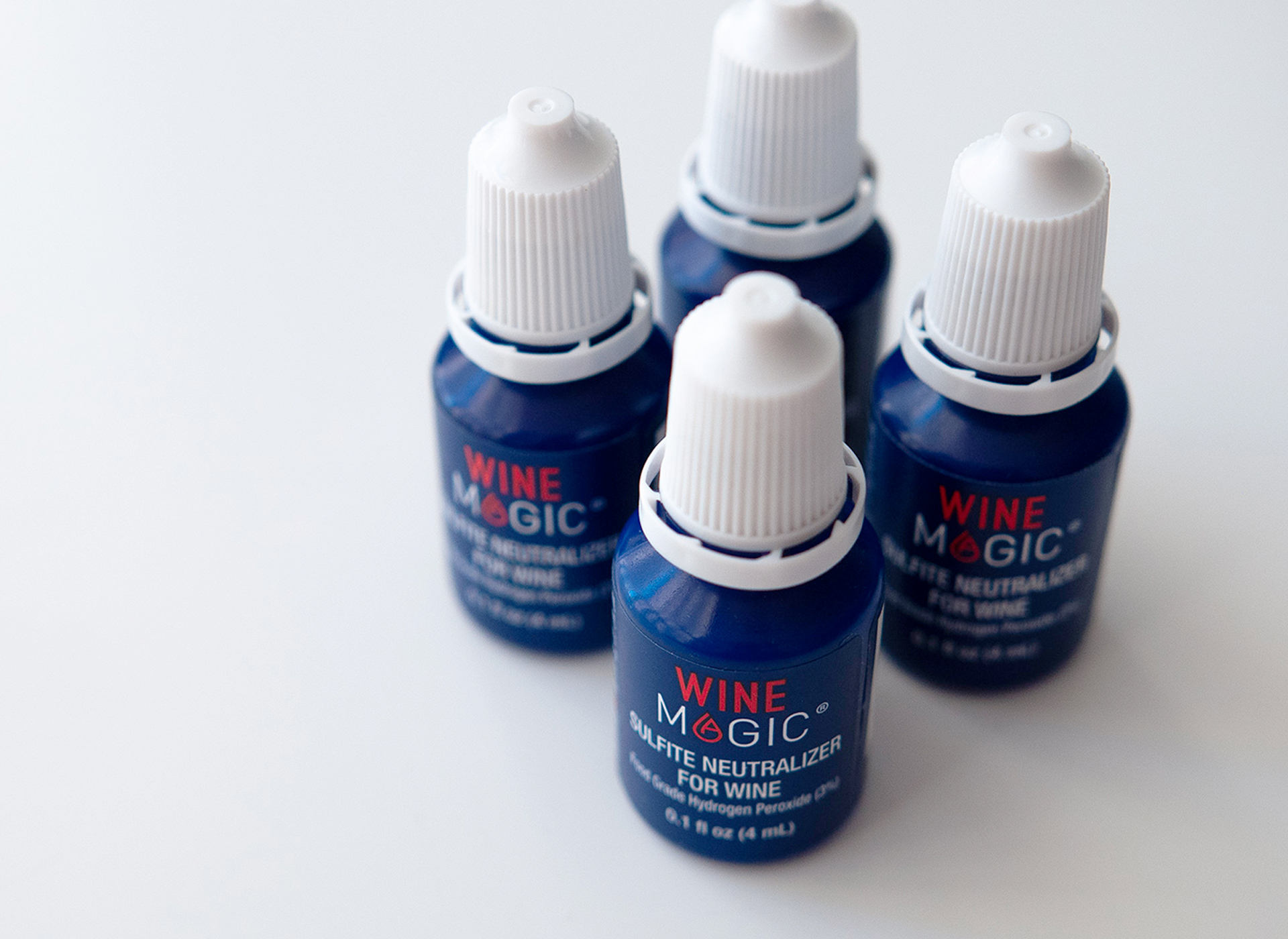
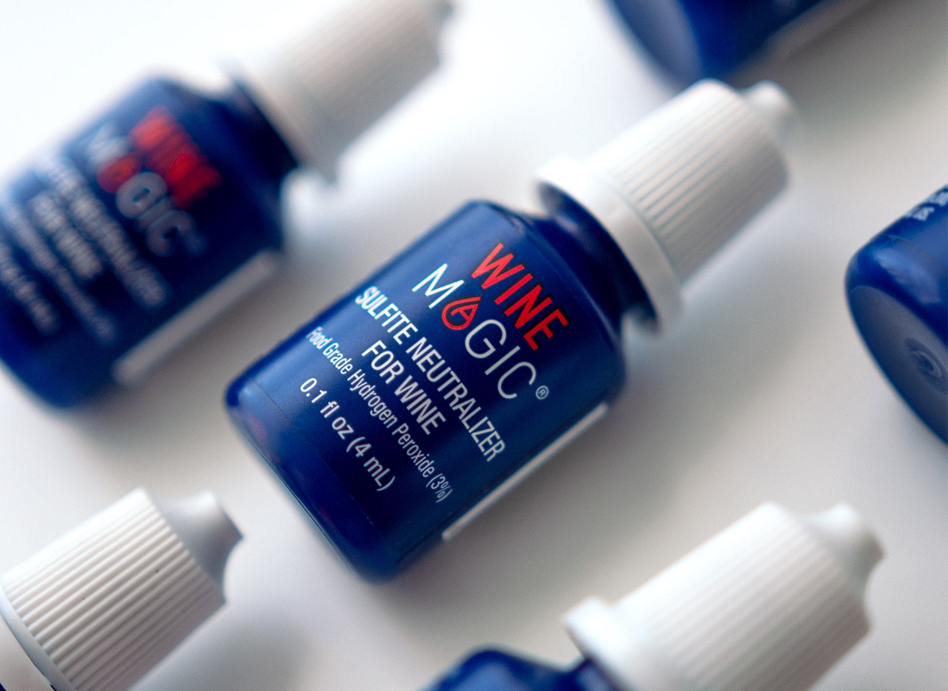
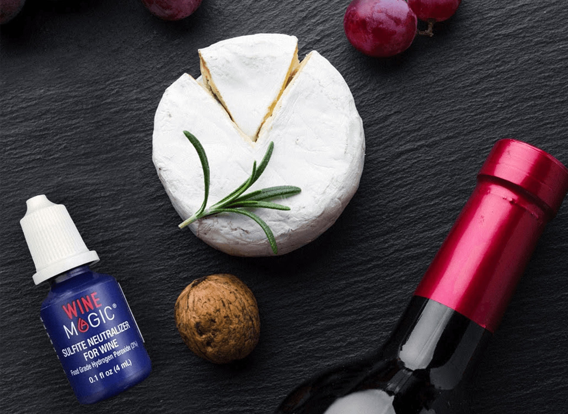
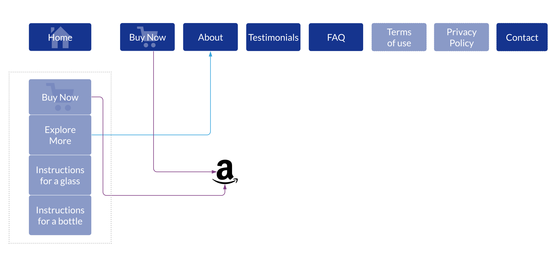
New Website
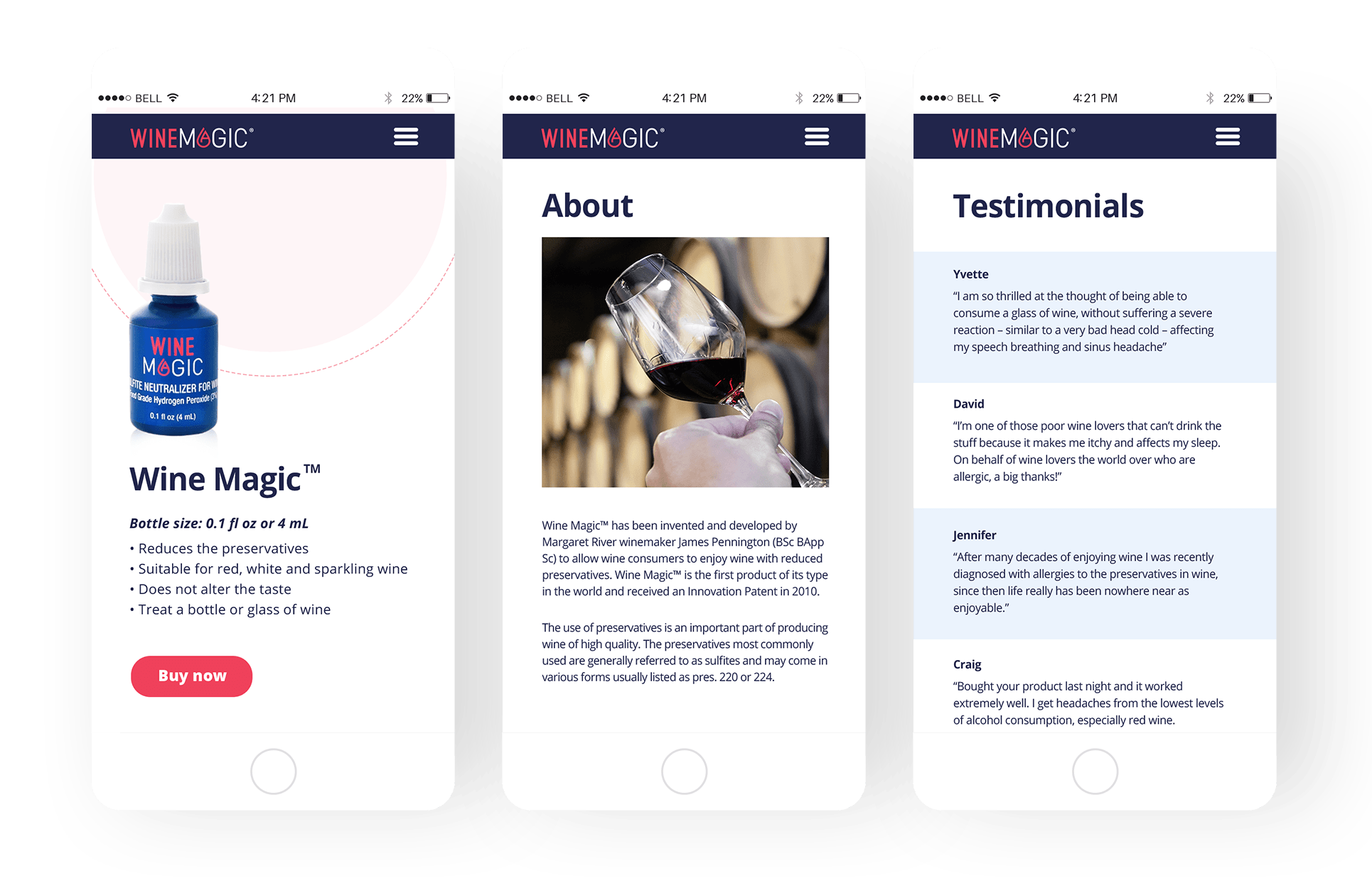
The main goal of the website was to explain what the product is and how people who love drinking wine would benefit from buying it. The main question was: how to convince target auditory to buy the product. I started with structuring the information the way all the details would be visible right away: short description of the product, the price for one bottle, the price of the bundle as well as instructions for usage.
